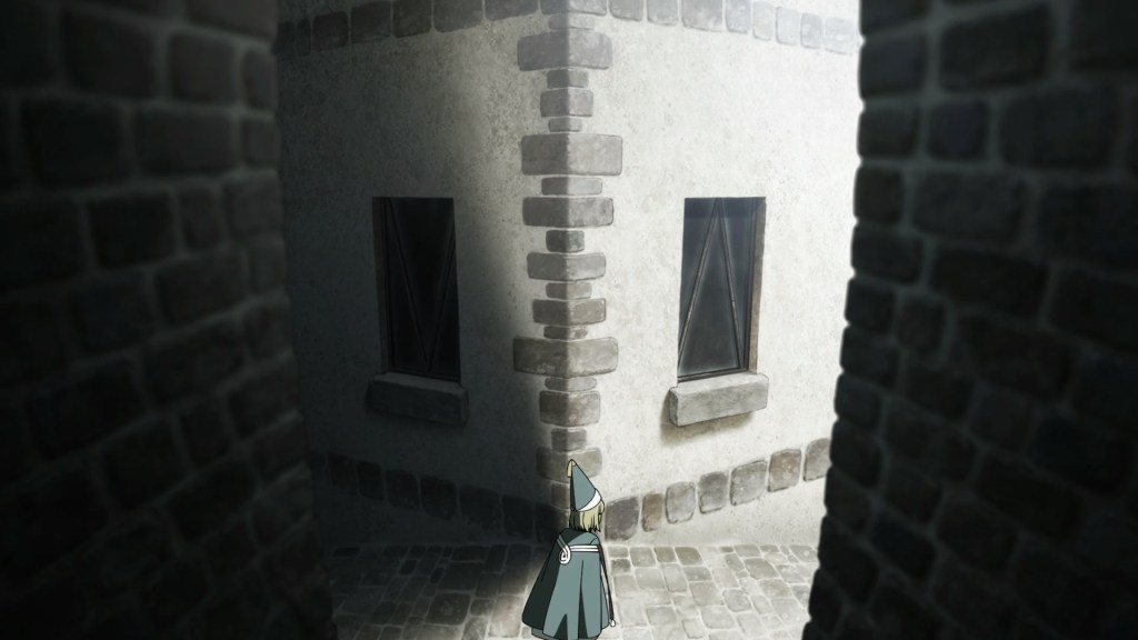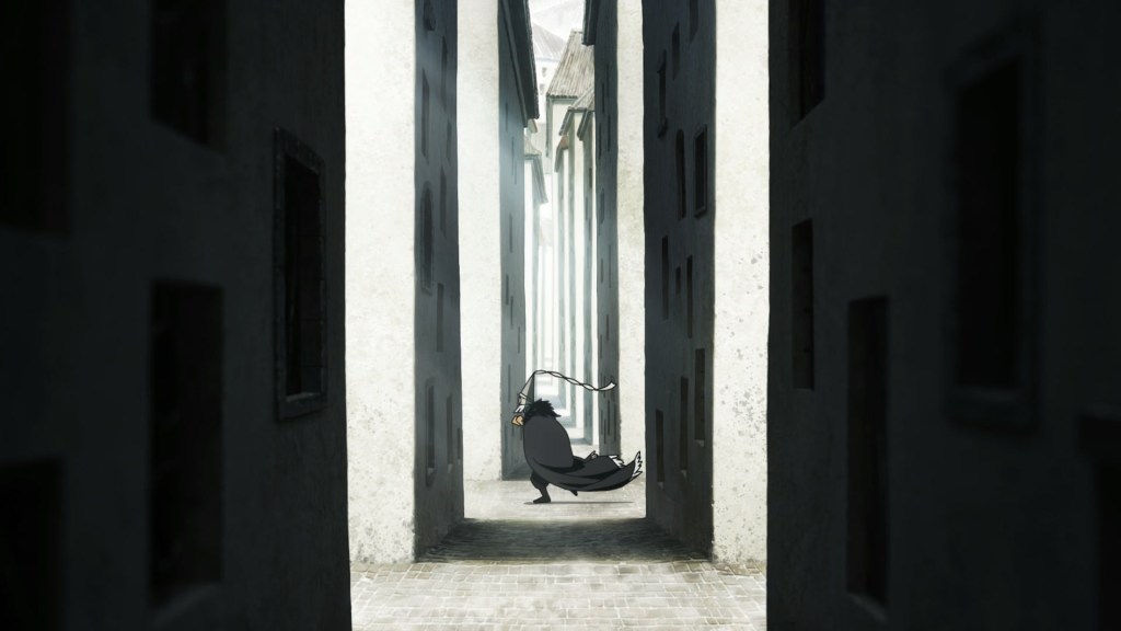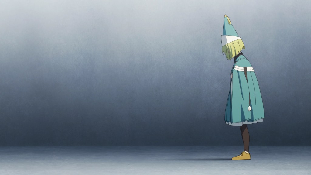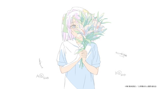
Original interview from Febri, published on May 05th 2026, as part of the Kamiina Botan Staff Relay Interview series, original interviewer: 太田祥暉 (oriminart); genga from the official website.
“Kamiina Botan, Yoeru Sugata wa Yuri no Hana” (from now on, just Kamiina Botan) has showcased the personality and idiosyncrasies of the enshutsu & animators in each episode, and this policy isn’t limited just to the show itself, but has been applied to the opening movie as well. Today we invited China, who was in charge of the enshutsu and storyboard, to talk at length about this peculiar opening movie, which exists in two versions, the regular one from the broadcast and a “complete version” in a 4:3 aspect ratio.
I realized they wanted an OP movie that would express my personality
— The OP movie for Kamiina Botan has a “complete version”, different from the one included in the broadcast, which was made in 4:3. What was the occasion that first drew you to this aspect ratio?
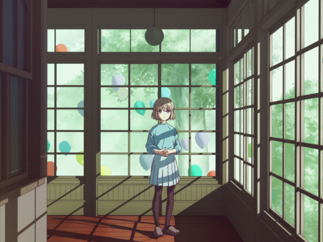
The first time I directed an MV [“Sore wo Ai to Yobu Dake”, それを愛と呼ぶだけ, 2020], this was my chance to work in a format different from TV Anime, so I thought I’d make something I simply couldn’t do for TV. That time was the first occasion. For that MV, at first I drew the storyboard using Cinema Scope [2.35:1], but when I asked Tsuchigami Itsuki, who was participating as an animator, for his feedback, he suggested: “Rather than using Cinema Scope to emphasize space, wouldn’t it suit you better to place the emphasis on the characters with 4:3?”. I took his advice, and while making anime in the 4:3 aspect ratio, I realized that kind of frame is a perfect fit for the expressions I want to evoke on the screen. From that moment onward, I kept using that aspect ratio in the works I directed, like “Detarame na Sekai no Melodrama” [でたらめな世界のメロドラマ, 2023] and “First Line” [ファーストライン, 2024], and perfected it with a trial-and-error process.
— I see. So, while you were still experimenting with it, the offer to work on the opening movie for Kamiina came in.
Yes. However, this time, I wasn’t planning on using 4:3 from the start. During the brainstorming session with Production Assistants (Shota) Hiyama-san and (Norimasa) Fujita-san, and Animation Director (Sakura) Watabe-san we had before I started working on the storyboard, we discussed with the assumption that it would be made in 16:9. But as I started working on it in 16:9, I couldn’t quite put it together in a way that felt good… So, I once again tried to reconsider my approach towards this work. I was invited on this project by (Hikaru) Murakami-san, who I’ve known since “Yama no Susume”, and not only that, but I knew this show would feature a solo-key animation episode by (Yuusuke) Matsuo-san, and the ED movies by (Kou) Yoshinari-san… Since I was called on this kind of production, I realized I too should have made something that would truly express my personality. So, I thought I’d make “something I wouldn’t be able to do in TV anime”, and “if I go too far, I’ll let Director Sakuma or Hey-sensei pull the brakes”. So, I changed the canvas’ aspect ratio to 4:3 and started redrawing the storyboards.
— And that idea got accepted as-is. The OP movie tells a short story, how did you go about its composition?
First of all, when I was reading the original, I thought the protagonist, Kamiina Botan, was a very elusive and inscrutable character. My first idea was that it would be interesting to explore the relationships between the girls at the dorm, while presenting the question of who she really is in a documentary-like fashion. That said, not much of that suspense element actually remains… As for the visual gimmick, the movie is structured around the dorm girls taking turns filming each other with an 8mm camera; the idea being that by evoking the relationship between the character holding the camera and the one being filmed, I wanted to portray the “direction” of their relationship, like an “arrow”, which is one of the work’s key concepts. Also, in order to bring out a sense of realism, I made the OP at 18 frames per second, as if it were filmed using the same camera they have in the show. Due to equipment-related reasons, this caused a lot of trouble to the photography and editing teams, but I felt that by not just going for an 8mm-like visual aesthetic, and instead also matching the frame-rate to that of the actual film Botan and the others are taking, we could bring out a greater sense of reality.
— The OP also makes frequent use of cinecalligraphy-like cuts [a technique where text, lines, and drawings are created by physically scratching the film surface], could you tell us more about that?
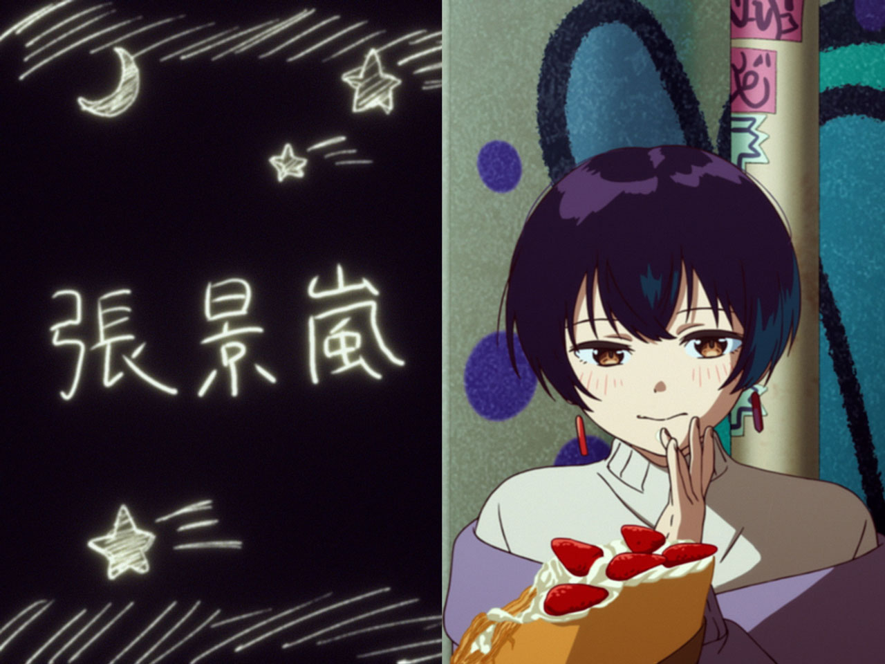
When I was trying to figure out what sort of things Botan and the others would likely play around with, I thought of cinecalligraphy. It’s a technique used in some trendy MVs, and I thought they might be watching those kinds of things. By the way, each character has her own defined handwriting, so we used reference material for each of them to make those cuts.
The only request was: “Don’t make the Director’s credit too big”
— Well then, I’d like to talk about things following the order in which they appear. From the intro into the opening vocals, Botan turns around and rises from her chair, and the A-section of the song features candid shots of the dorm residents.
The concept for this OP was “the dorm girls pointing the camera at each other”. How would each of them react to the camera being pointed their way? What expressions would they make? Or even, with what sense of distance would they point the camera? I thought up each cut while keeping these questions in mind. I was also conscious of using lighting to indirectly imply the feelings the character filming has for the subject. And I chose the shots by thinking what moments would the girl recording think of as dear of the girl being filmed. The shot of Kanade looking at her PC with hollow eyes was also perceived as dear and lovely by the character filming it… that was the idea behind it.
— When B-section starts, balloons appear, and the outside of the dorm also makes its appearance.
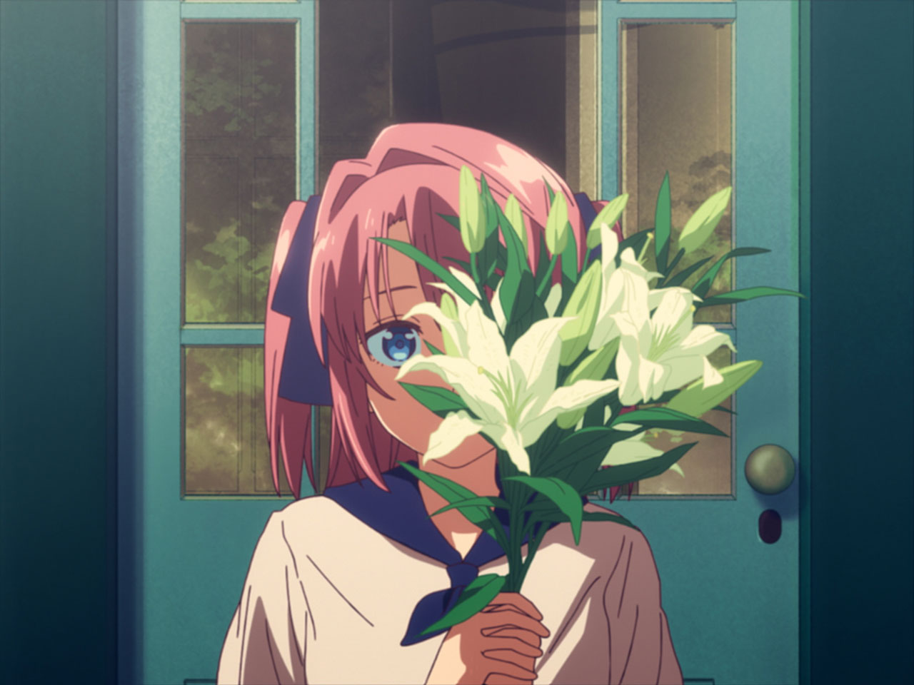
I was thinking of Botan and the others trying to set up a surprise for Ibuki, and those shots are the result. I wanted the balloons to release at the beginning of the chorus, so I started from there and worked things backwards. Also, the reason I made the dorm the setting for the OP, is because I believe the main characters of Kamiina Botan aren’t just the six students residing there, but also the dorm’s building itself. If it weren’t for it, the six of them wouldn’t have met, so I wanted to beautifully portray the dorm as a proper character as well.
— And when the chorus starts, the lyrics “Nee” appear on the screen as cinecalligraphy.
The “Nee” followed by the cut of Ibuki turning around, was something I really wanted to do from the very beginning of when I started working on the storyboards; I designed the OP around that cut. At the start of the OP, there’s also a cut of Botan turning around, and I wanted to emphasize the contrast between them. The opening cut is filmed from a distance, highlighting the blur of the automatic zoom, while the chorus one features the blur of the character filming physically pulling back from the subject. In both cases, I held the shots longer in order to make the most of that handheld camera feel. This chorus cut was built on the camera work by the 3D team, with (Naoya) Morotomi-san handling Ibuki’s key animation, and the team at Production I.G taking care of the in-between animation. I’m truly grateful that everyone, including Animation Director Watabe-san, stuck with me patiently through the many retakes. I think it came together into a really good cut.
— During the chorus, we move around the dorm’s garden, and then land on a very cute cut featuring Botan lying down, correct?
It connects back to the theme I was originally thinking about―“who is Botan?”. I wanted to capture the many different sides of Botan, even just in her smiles. I asked (Manami) Honda-san to handle the key animation of the cut in the garden, and (Komoto) Yusei-san the peace-sign cut. The latter in particular, I thought of it as the second defining cut of the OP, and it’s also the one where Soigne‘s name comes up, so I’m really glad it turned out so cute.
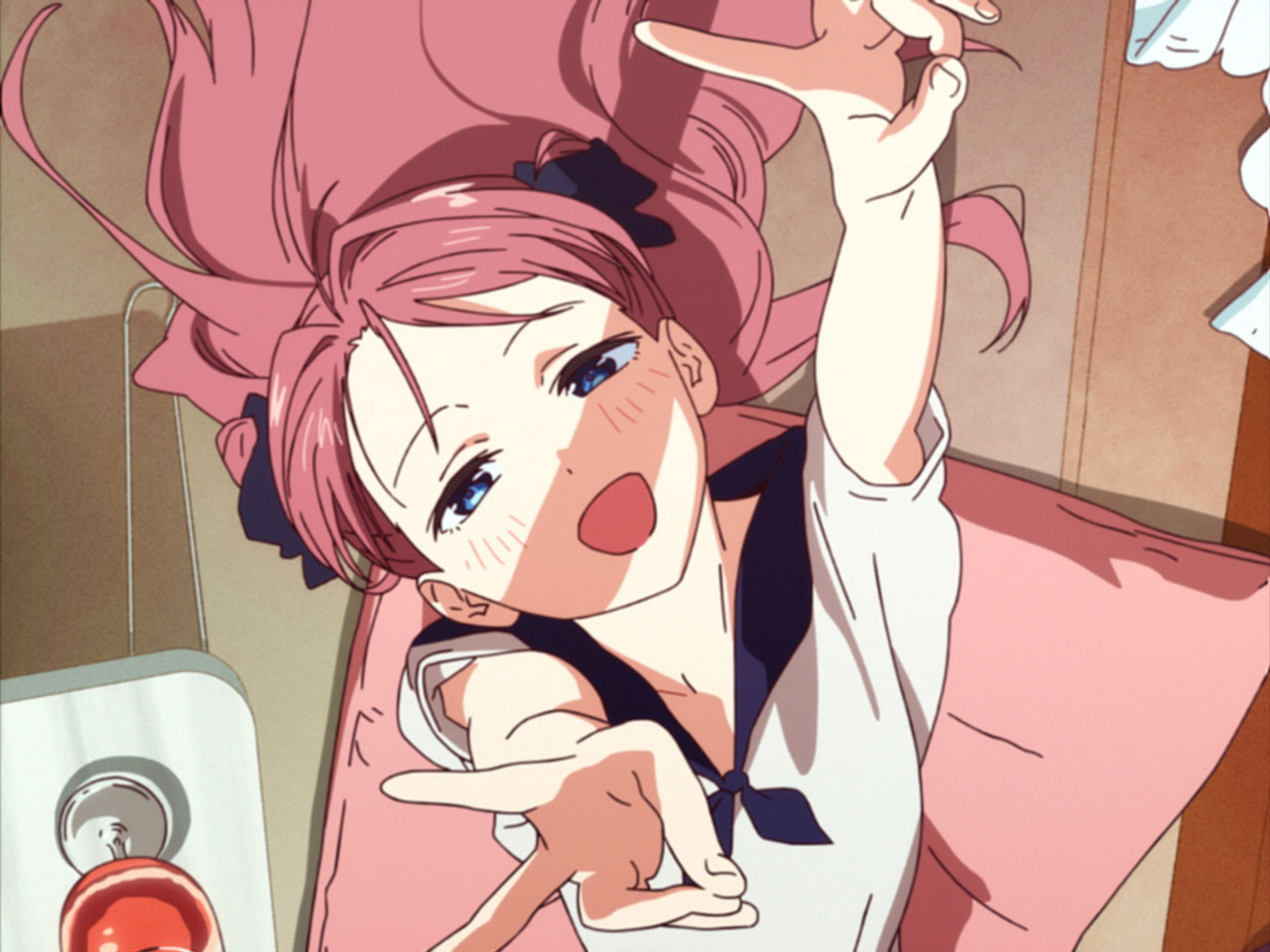
— Then, there’s a series of cuts showing each character’s name, but in the storyboards, they were supposed to show the song’s lyrics instead. What happened?
When drawing the storyboard, I tried to present it in kind of a meta way, by lining up the characters with parts of the lyrics that would match them. However, as the production went on and I got more and more absorbed in the world of Botan and the others myself, I felt that kind of approach was somewhat misaligned, so I reworked it into its current form. The cinecalligraphy cuts involved trial and error right up to the end, and ultimately I was able to push through by directly inputting the TP [trace-and-paint] materials myself.
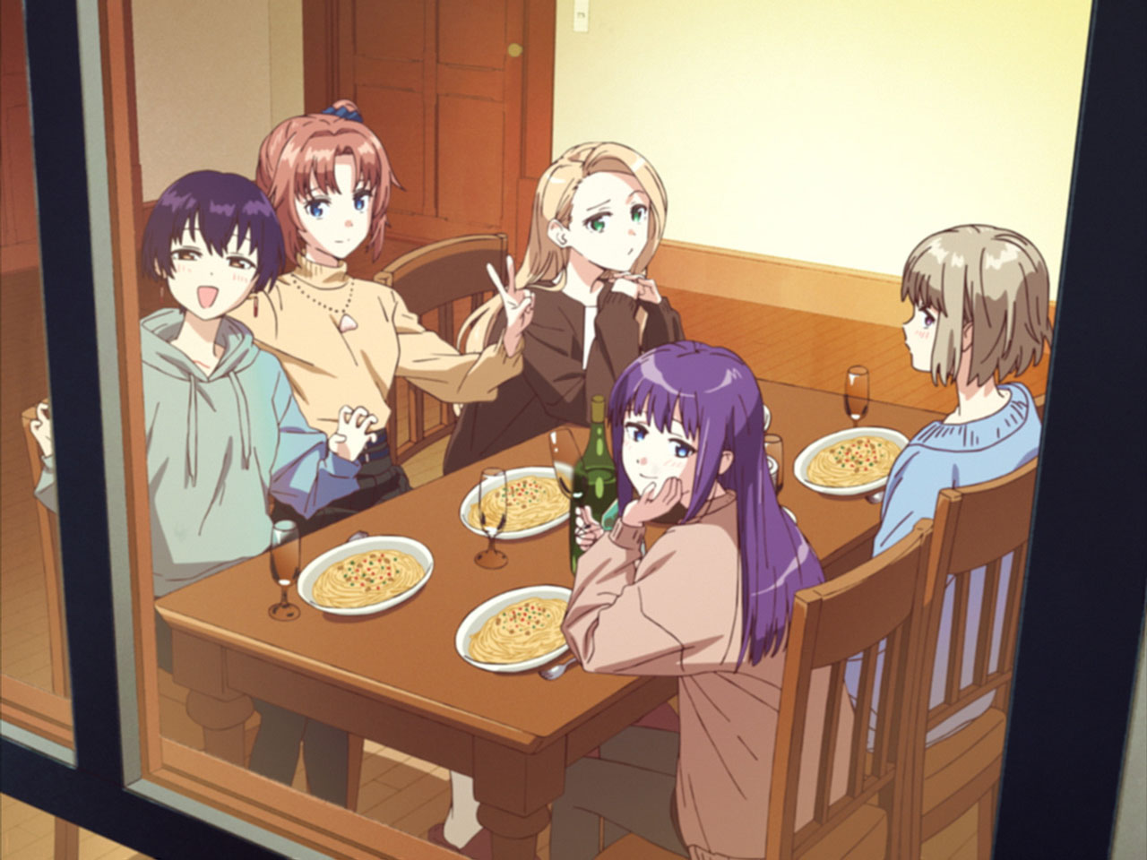
— Toward the final stretch, starting from the cut key-animated by Miyahara Takuya-san where the five girls are filmed through the glass, cuts featuring larger groups of characters appear for the first time. What was the reasoning behind that?
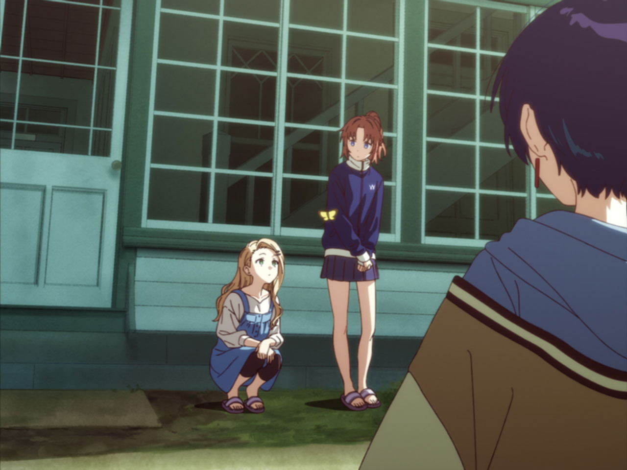
As the frame gets more crowded, I feel the shots start to feel more anime-like… so I wanted to avoid that kind of compositions in the early parts. So, the basic approach was to focus on one character at a time, but I also wanted to leave room for the camera to turn toward the kind of inconsequential everyday scenes you might find in the dorm, and that’s the nuance I tried to build into the structure.
— After that, there are a few cuts featuring the relationship between Botan and Ibuki.
I lined up the “Kimi” [“You”] and “Asu” [“Tomorrow”] lyrics with Botan and Ibuki, respectively. Here too, in the original storyboard, the actual lyrics “Kimi” and “Asu” were supposed to show up… But this movie is supposed to be something that the characters themselves are filming with an 8mm camera and then editing, so I thought that making the song’s lyrics appear would be somewhat wrong.
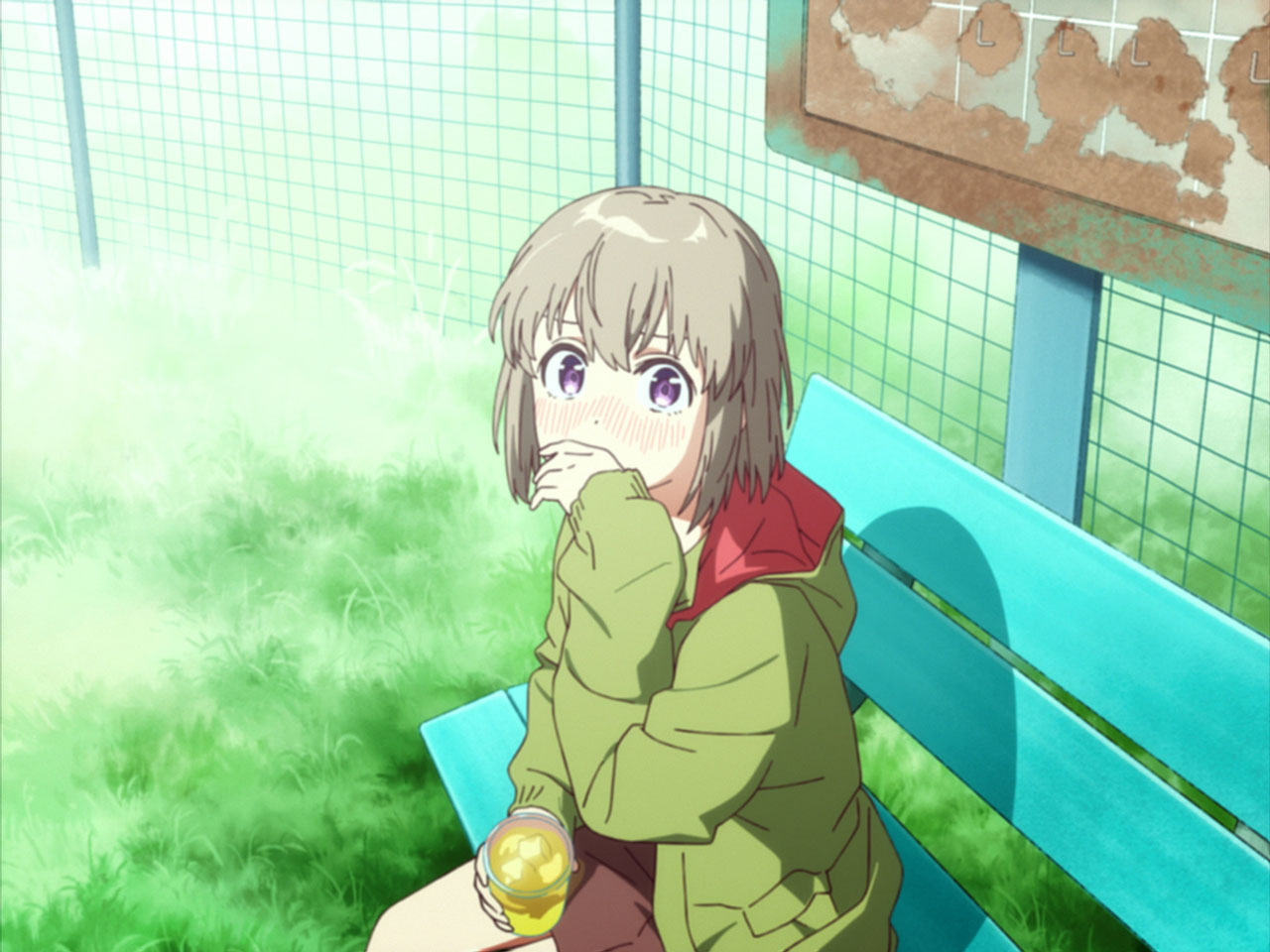
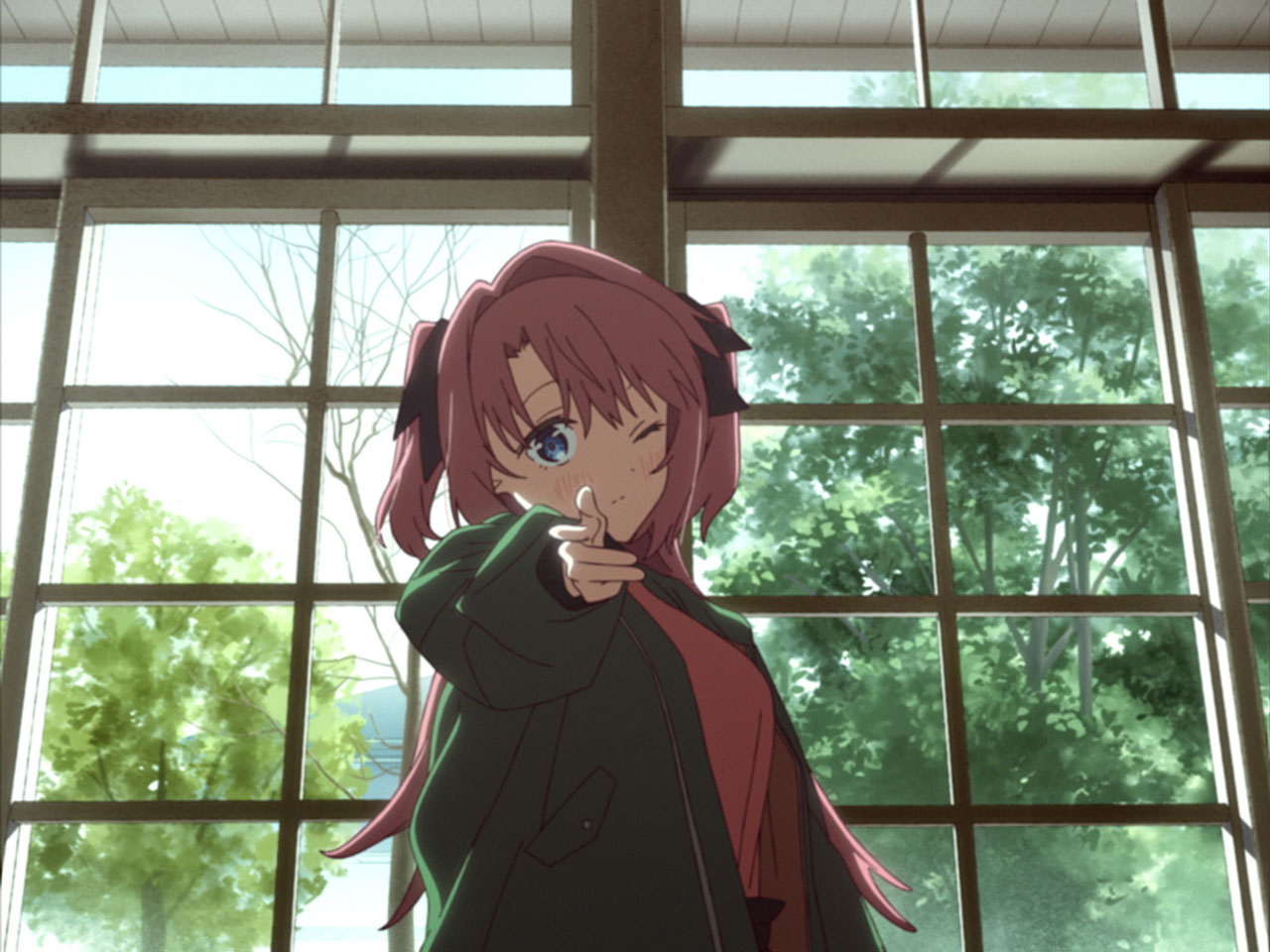
— At last, after making the “Bang!” gun-firing gesture, Botan steps out of the frame.
That’s the cut where Director Sakuma’s name gets shot. At the storyboard meeting, the only request I had from him was: “Don’t make the Director’s credit too big”. So I honored that (laughs), and thought: “Well, if I can’t make it big, I might as well shoot it”. I always put a lot of care into how the title appears in rhythm with the music, so I’m glad a fun idea came to me this time as well.
I’d like you to enjoy the differences with the broadcast version too
— By the way, the peace sign at the end of the “complete version” isn’t there in the storyboard…
At first, the storyboard closed off with Botan doing the firing gesture, but once we put it all together, I felt it was missing something. So, I let my imagination run with the question of what the particular girl holding the camera would do next, and that’s how it took its current shape.
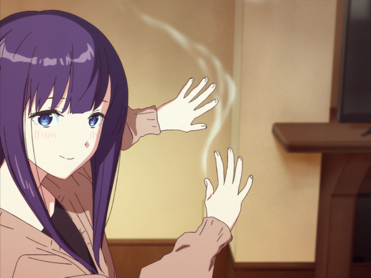
— Now that I look at it again, there certainly are a lot of cuts of Kanade smoking, aren’t there? (Laughs).
I’ve seen so many great cigarette scenes in movies, but since entering the anime industry I’ve rarely had the chance to depict them. So, I’m afraid I got a little carried away this time (laughs). It was a lot of fun being able to try out all sorts of ideas just with the way she exhales the smoke. My smoking deskmate animator once told me that “when you inhale and exhale, the smoke gets filtered by the lungs and comes out thinner”, and I incorporated that into the animation.
— What are your feelings now that the production is complete?
In the past works I directed or did enshutsu for, the “realism of the characters” has always been a central theme for me personally, and I’ve always wanted to achieve its culmination at some point. This time, I’m satisfied I was able to merge the atmosphere of the work Kamiina Botan with my personal taste into a movie everyone can enjoy. Also, I’m really glad I was able to have Watabe-san take on the full scope of animation direction duties. Watabe-san worked as a key animator on the “Kusuriya no Hitorigoto” episode I directed [Season 1 Episode 4, 2023], as well as many others, and I’ve always wanted to work on a proper project with her. I love how her sensibility is a hybrid of Kishida Takahiro’s approach to line selection and Kobayashi Keisuke’s approach to movement. In practice, it’s not even just a matter of sensibility, Watabe-san oversees the animation with extremely meticulous care, right up to the deadline, down to the level of whether to add or remove a single in-between drawing, or add or erase a single shadow line. Without her passion, we never could have reached this level of quality. Beyond that, I was fortunate to have talented people at the core of the production, the animation checkers, colorists, background artists, 3D and photography teams… all of them delivered beyond my imagination, at 120% of what I had envisioned. I’ve mentioned a number of the wonderful staff members involved, starting with the key animators, but almost all of them were brought in by Fujita-san and Production Assistant Hiyama-san. I am simply in awe of the network of connections that Soigne has built up. It was a wonderfully fulfilling production to work on as a director, one where I could be as demanding as I wanted.
— There are also all the differences with the broadcast version to look out for.
Absolutely. The broadcast version is in 16:9, but I put a lot of care in the way the credits show up against the song’s rhythm… It has always been a guiding principle of mine when working on OP movies to create something that will make viewers remember the names of the key staff and the studios involved. So, this time, I had fun with making the credits stand out too. On a finer note, the Soigne logo has actually been adapted into a Kamiina Botan-specific version, and other touches like that in the credits can only be found in the broadcast version. I’d be happy if viewers could enjoy the “broadcast version” as the OP for Kamiina Botan, and the “complete version” as a home movie filmed by Kamiina-san and the others.